From Frustration to Satisfaction:

How we improved the ordering experience on KFC's mobile app

TIMELINE

Jan - Apr 2023

PLATFORM

Mobile App

PROJECT

University UI/UX project

COLLABORATORS

Chua Ji Xiang (Me)
Chng Li Shuang
Leow Siew Ting
Desmond Tan
Tang Zhao Sheng
Overview

INTRODUCTION

The KFC's mobile app allows customers to order their favourite meals directly from their smartphones conveniently. A typical process involves browsing of menu, customization, and secure online payments.

The app also offers exclusive deals and promotions, and order tracking lets customers monitor their orders at their convenience, providing a seamless experience to order food from KFC.
Dashboard mockup

MY ROLE

Define research goals and objectives
Strategize research methods
Derive design principles
Create wireframes and prototypes
Polish final product with insights from usability testing

PROBLEM STATEMENT

Despite having its own mobile app for ordering food, many KFC customers prefer using third-party apps to order KFC food. This indicates a potential problem with KFC's app usability and user experience compared to other competitive apps.

BUSINESS 
OPPORTUNITIES

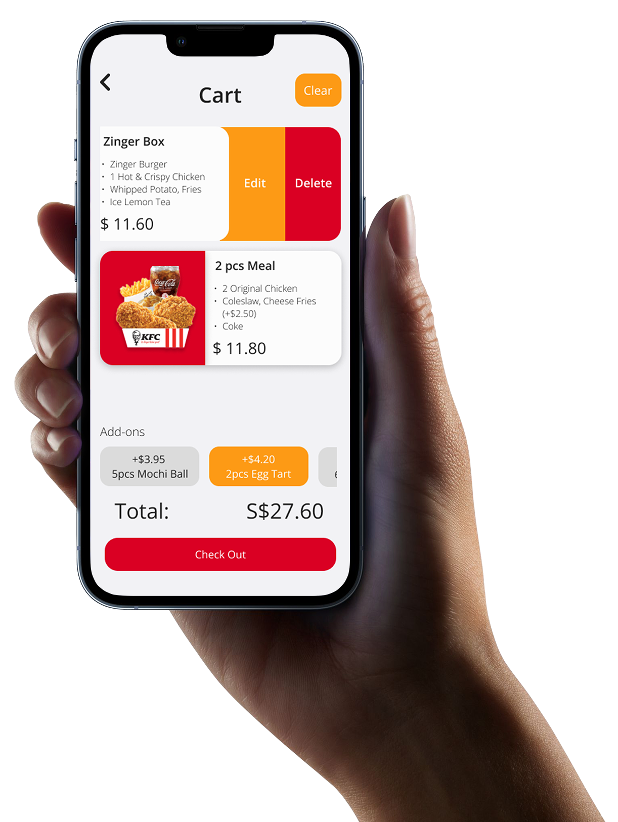
The KFC mobile app streamlines the ordering and payment process, providing users with a fast and hassle-free experience. Moreover, it offers valuable data insights for KFC to enhance its menu offerings and marketing strategies.

Project Goal

What we aimed to do?

so that customers can order their food more easily

Speed up the ordering process

Discover redundant areas within the app and remove them

Redesign priorities according to
user expectations

Show customers what they want and need first, and place less priority elements towards the back

Guide customers through their process smoothly

Redesign the current customization process in such a way that makes customers feel guided and easy to use
Team Collaboration

Behind the Scenes of Our Design Process

In the research phase, my main contribution was to design and conduct an effective behavioural interview to achieve our research objectives. Once we have the results from various methods, I leaded the team to craft meaningful and captivative insights.
Mockup

Rich Picture

We started our research by mapping out the different processes experienced by customers using the KFC mobile app.
Mockup

Research Responses

I contributed to the team by designing the behavioural interview, as well as crafting survey questions and field studies. We also used Figjam as a collaborative tool, which made our online and offline discussions seamless.
Mockup

Mental Model

I proposed to the team to conduct a mental model check on potential KFC customers as it will help us better understand what is their expectation of an ordering mobile app system and design a better interface for them.
Mockup

User's Journey

After collecting and analyzing all of our research data, we put together a user experience story that allowed us to understand what our users are doing at each step and how they're feeling.

This was a great opportunity for us to identify any potential pain points and improve the overall user experience.

Wireframes

The next step for us is to explore different possibilities for the KFC mobile app. Through a brainstorming session, we carefully evaluated the pros and cons of 5 wireframes made by the group and ultimately redesigned new

3 Contenders

Usability Test

So we let
our users try
our prototypes

Before we conduct our usability testing, we took the 3 ideas and merged them into 2 prototypes.

Interviewees are asked to use and evaluate these prototypes given a small scenario that they have to accomplished.

Prototype A

What they say

"Didn’t know if my food has already added to cart because there is no any indication on the cart icon."
Zi Feng
University Student
"Normally, for me, the promo code is entered at the checkout page"
Chloe
University Student
"Like the order summary page. I can double check if everything is right!"
Ru Yi
Fresh Graduate
"I was bothered by having to choose location at the back. Did I miss something?"
Shawn
Fresh Graduate
"I like seeing my customizations in a single page."
Je'taime
University Student

Prototype B

What they say

"Couldn't understand what the promotion plus button was..."
Kai Li
University Student
"Location and pick up option label look like toggle button.."
Ophelia
University Student
"Nice visual animation in the customization process"
Terrence
Software Engineer
"There is hierarchy here, I can see promotions, then popular items in sequence clearly."
Chloe
University Student
"The menu page feels quite long. It would be better if there are category options to guide me"
Jun Nan
University Student

We Hear Them.

After analyzing our test results, we have decided to combine the best of both prototypes together as the final interface.

Presenting

KFC Mobile App

Designed with familiarity in mind to guide you through
a fast ordering process.

Landing

At the top of our app, you'll find a clear overview of what's available in KFC. Below that, you'll see three distinct dining options to choose from. The layout is clean and easy to navigate, as validated by our usability tests. We found that many users are comfortable with selecting their preferred dining option early on in their app journey.

Promotion

Enjoyable browsing experience. We understand that it can be difficult for users to view promotion items on the menu page, especially when there are many items to scroll through horizontally. That's why we made the decision to improve this experience for users who want to see more items in a comfortable manner.

By clicking on the "See More" button in the Promotion section from the menu, users can bring up a new screen that makes it easier to view numerous items at once.

Customization

Visual Animation. At the heart of our app design is the goal of making it interactive and responsive to our users. We recognized that the customization process was identified as the most difficult feature to use during our user research, and so we made it our priority to improve this experience.

Through our usability testing, we found that users responded positively to the engaging animations that accompany the process of assembling their meals. This visual feedback made them happier and more satisfied with the app.
We listened to our users and found that they want a hassle-free and quick way to customize their meals. So, we made it possible by putting all customization options in one screen for easy access. No more endless scrolling or clicking through multiple pages. It's a time-saving solution, perfect for users who already know what they want to customize.

Your Cart

Our improved cart sorts meal into cards that display your customized options. With native iOS phone features, simply swipe left for edit/delete meal buttons.

Plus, quick add-ons are now conveniently located at the bottom. There's no need to head back to the menu and search for it. We want you to focus on enjoying your meal, not worrying about your order!

Order Summary

Aligned with our user's expectations, we have designed this page to include the option for users to enter a promo code before checking out.

A summary of their order details is also displayed, allowing for a quick glance to ensure all details are correct.

Payment options are now more accessible, with the payment details presented clearly. No more difficult searches for payment options!

Order Status

With our new feature, you can now receive real-time updates on the status of your order, so you never have to worry about whether it's being handled promptly. This added transparency ensures that you can have peace of mind and trust in our service.
We understand that seeing all the order details at once can be overwhelming. That's why we've redesigned the order details to be a separate sheet that you can easily access by sliding up.

Our users have given feedback that it looks nicer and feels more comfortable for them to see what they need.
Don't panic if you accidentally close this page. Let us guide you back.

You can easily find your order status by heading to the home page where you can quickly view your order number and status at a glance.

We've received positive feedback from users who appreciate the simple and informative design.

Highlights

Reflection

Takeaways

This project has provided me with a fresh perspective on interface design. As a student with domain knowledge in engineering, I was accustomed to developing solutions as soon as I identified a problem. However, through this project, I learned to explore areas for improvement by utilizing various research methods and narrowing down the scope of existing problems faced by current users. This approach proved to be more effective as it allowed me to consider the opinions of others and not just rely on my own assumptions.

Once we had defined our project scope, we began brainstorming ideas, and I found it to be a very fruitful experience. It was interesting to see the different approaches my team suggested to address the existing issue. Using Figma, we developed three prototypes to let users test and evaluate our designs. This was an invaluable step in the process as it allowed us to gain feedback and ensure that our solutions were solving the problem at hand. After analyzing their responses, we used their feedback to refine and improve the final app design. This iterative process allowed us to create a solution that truly addresses the needs and preferences of our users. Through this project, I learned the importance of constantly seeking feedback to create a better product.